Website redesign / Accessibility / EdTech
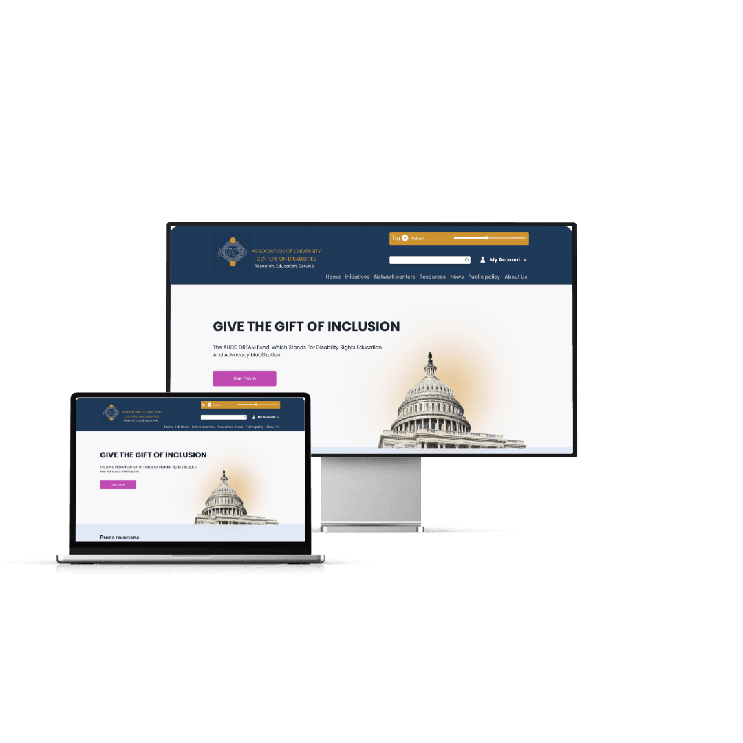
AUCD website redesign: a more accessible, user-friendly platform
Overview
A redesign of the Association of University Centers on Disabilities website to make it more accessible and easier to navigate, and to raise awareness of the institution's work.
- Role
- UX Designer
- Project type
- Academic
- Duration
- 1 month
Background
AUCD is a resource for agencies, organisations and policy makers who support people with developmental and other disabilities and their families. It advances policies and practices that improve their social, economic, educational and health well-being.
The problem
“The current interface is not accessible for users with disabilities: few icons, lots of small text and excessive white space make it hard to find important information.”
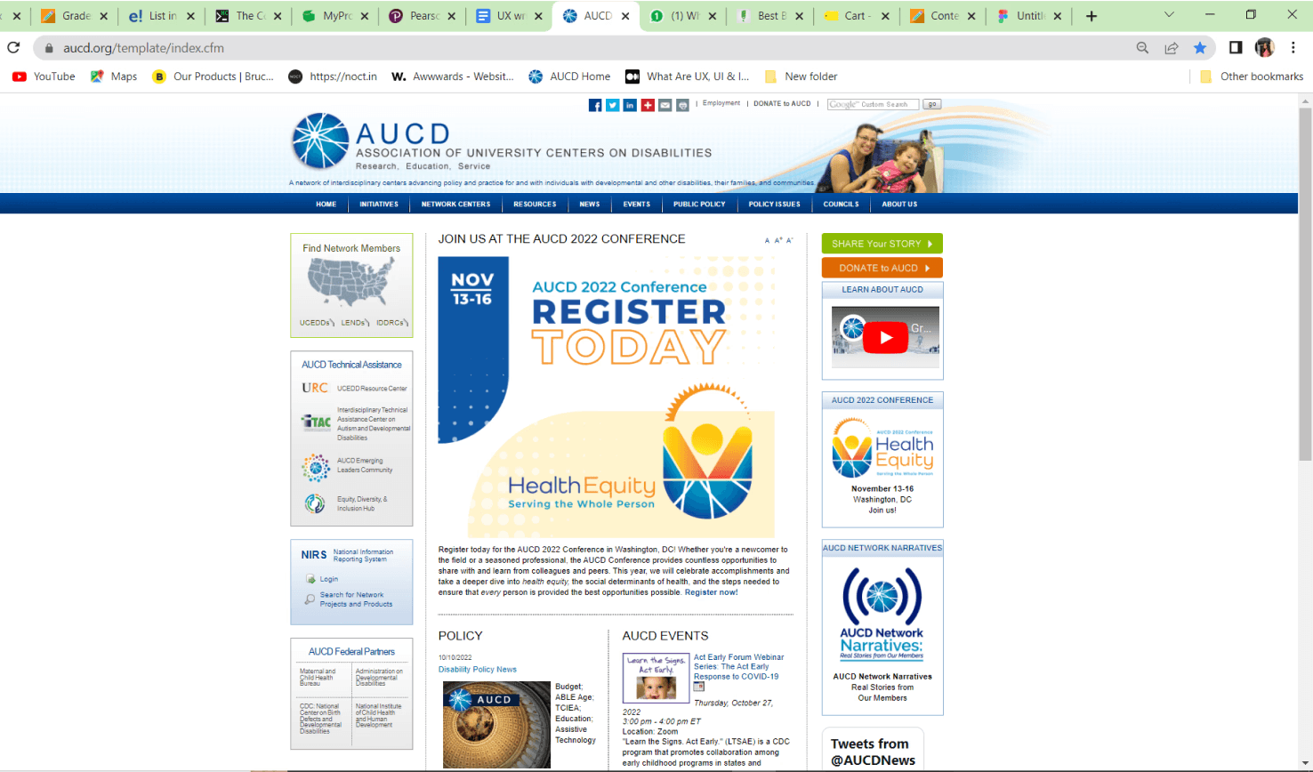
The solution
Organise information more clearly, make text and icons easier to see, and use colours that are comfortable for everyone — a friendlier design that makes it simpler to find information and connect with others.
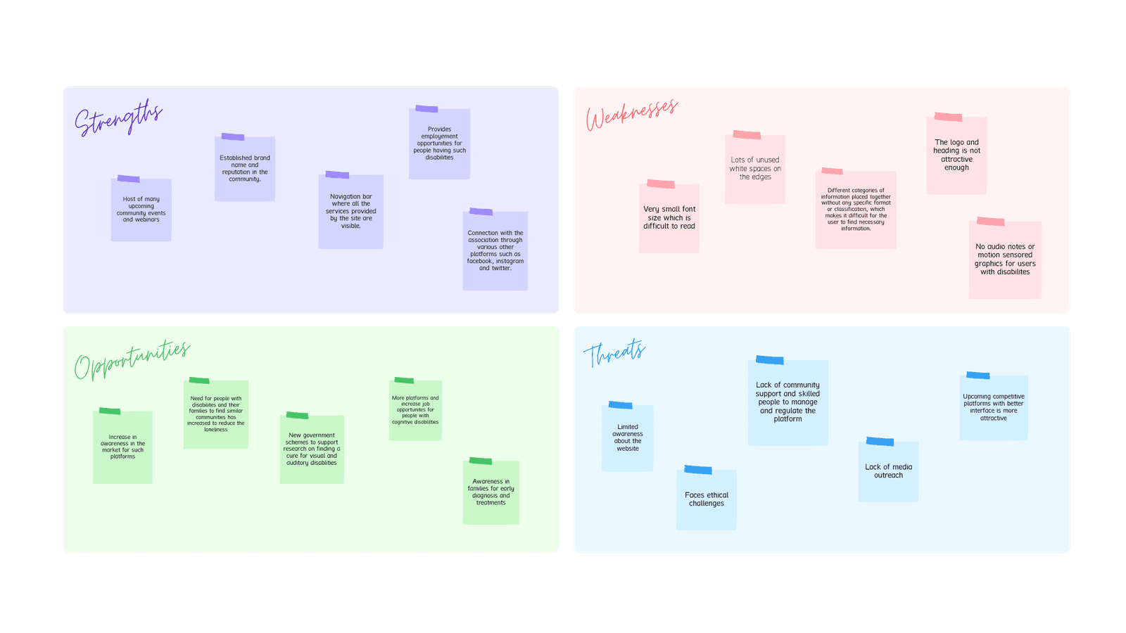
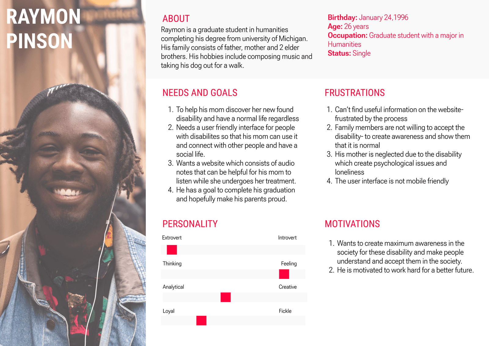
Research
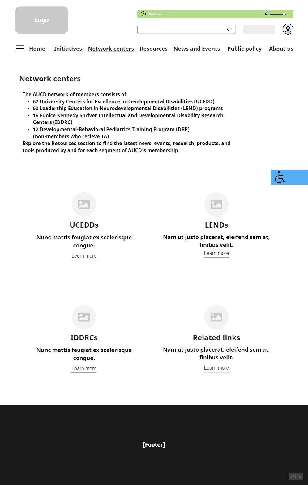
Low-fidelity mockups
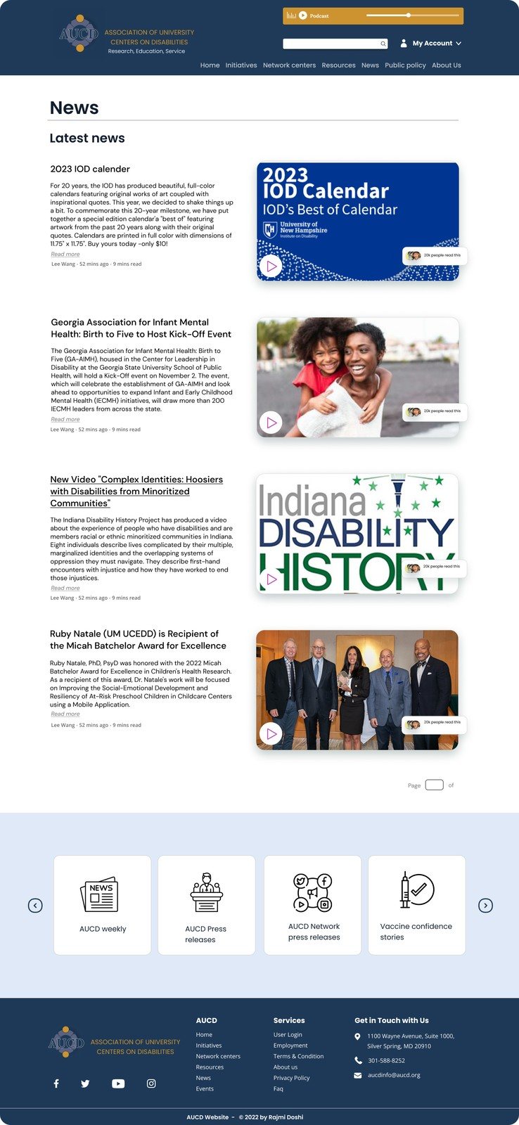
Hi-fidelity prototypes
- Homepage: reorganised navigation and reduced clutter for faster access to resources.
- News and events: larger icons, clean layouts and sorting by date, type or location.
- Share your story: a simple, accessible form with large, clearly labelled fields.
- Network centers: scannable cards plus a map to locate centers.
- Accessibility menu: adjustable text size, contrast, colour scheme and screen-reader settings.
Learnings
Redesigning key screens — homepage, news and events, network centers, share your story and a new accessibility page — deepened my understanding of visual design, UX writing and inclusive design. The goal: a platform that works for everyone.