
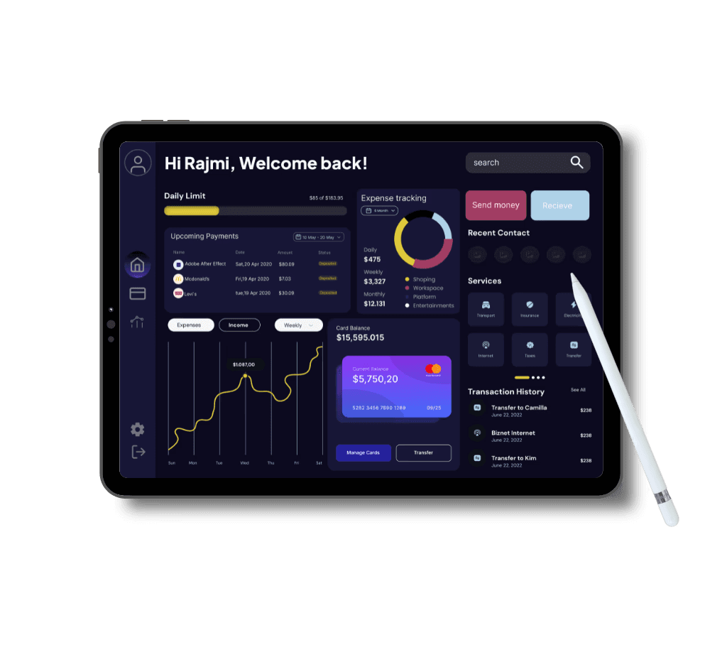
Dashboard design / B2B2C / Fintech
FinTrack: a personalised financial dashboard for decision-making
Overview
FinTrack simplifies financial management with a customisable dashboard that consolidates accounts, tracks budgets and visualises data — so people can make informed decisions without the chaos.
- Role
- UX Designer
- Project type
- Freelance
- Duration
- 1 month
Background
In today's fast-paced world, managing personal finances can feel overwhelming. With accounts, investments and expenses scattered across platforms, people struggle to get a clear view of their financial health. FinTrack gives them one comprehensive dashboard that makes tracking effortless.
The problem
“Overwhelming financial tools create chaos instead of clarity, leaving users struggling to track spending, savings, and investments.”
The solution
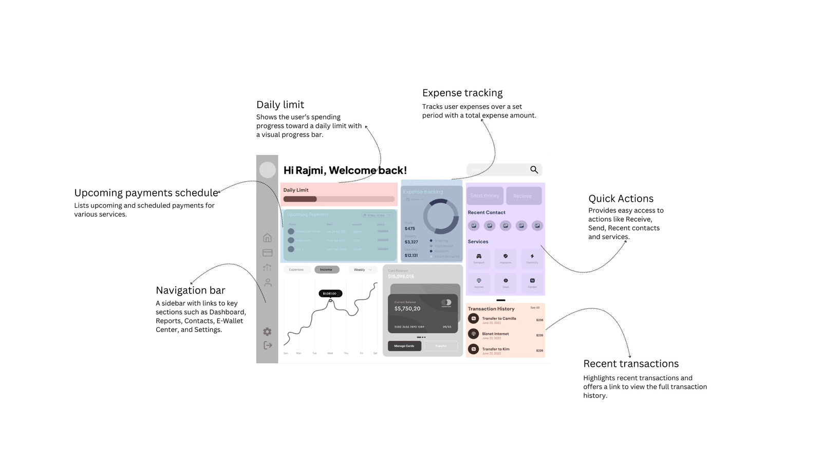
FinTrack aggregates all financial data in one place: a streamlined overview page, customisable layouts, interactive graphs for budgets and investments, and a dark mode for comfortable everyday use.
The goal
“Imagine a dashboard that brings all your financial data together, with intuitive navigation, customisable features and clear visuals.”
User research
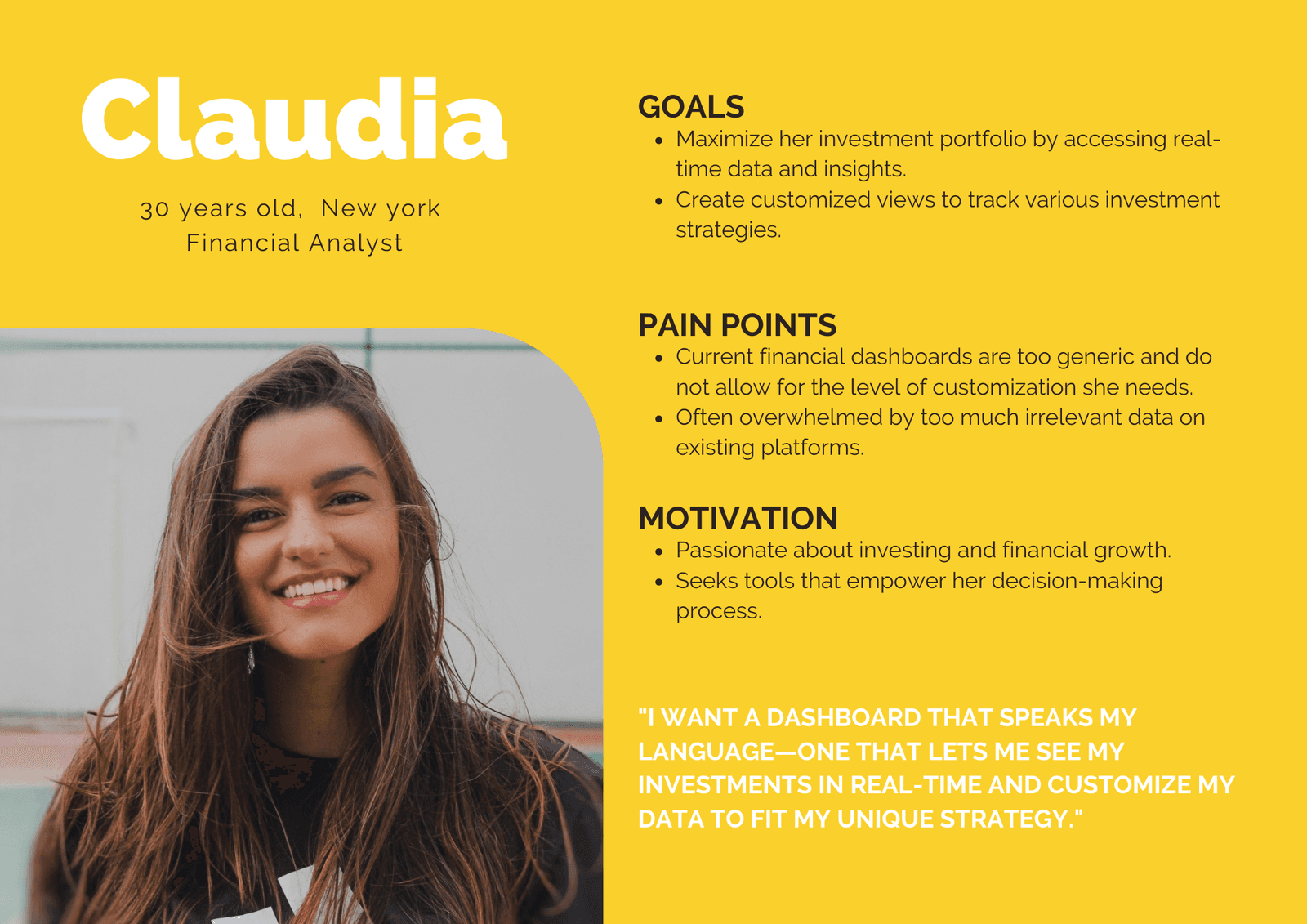
I ran user interviews to uncover pain points and preferences, created personas, and built an information architecture to streamline navigation.
- Overwhelmed by data: most users felt cluttered information made essential data hard to find.
- Fragmented accounts: users were frustrated managing accounts across many platforms.
- Desire for simplicity: users wanted customisation and streamlined navigation to reach what matters quickly.
Design approach
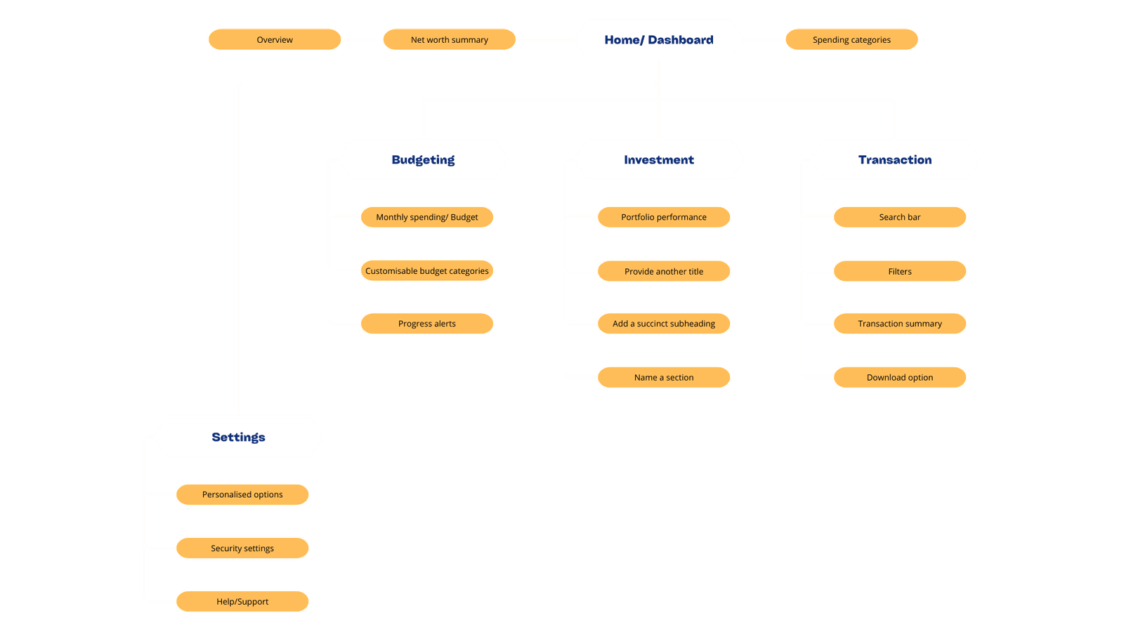
Before sketching, I created a sitemap to decide which features and pages would help users most, grounded in the research.
Wireframes
Results
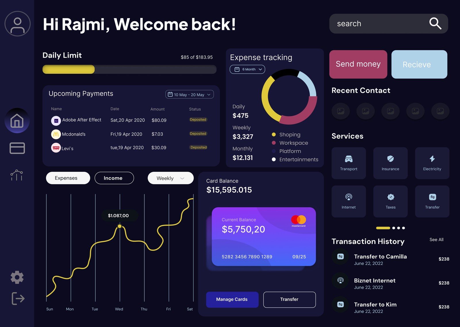
The result was a user-friendly dashboard that turns complex financial information into well-organised, accessible sections. Users could see balances, savings, upcoming payments and expenses at a glance without feeling overloaded.
Usability testing showed a marked improvement in task efficiency, and advanced users especially valued the customisation options.
Learnings
- Balancing simplicity and functionality: easy to use, yet robust for advanced users.
- Intuitive navigation: quick, confusion-free access to critical information.
- Research and testing: refining the design with feedback to improve flow.
- Collaboration: aligning design goals with technical constraints and business objectives.